Nicole gave me the idea of using the Emigre typeface Missionary for my Shakespeare book, when I researched the font I loved the whole Emigre style and wanted to form a new book around it. I used only their typefaces and their style, and developed a new type book about the decades of rock n' roll; I wanted each page to look like a mini poster. Emigre is known for their cutting-edge typefaces and their publication design, therefore I wanted to incorporate an editorial look along with their beautiful typefaces.
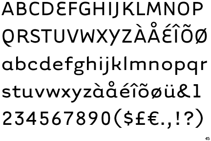
- Emigre Design
- Designer: Sibylle Hagmann
- 1999
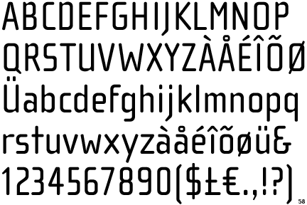
- Rather than trying to imitate letterpress technology, the designer tried to take advantage of the idiosyncrasies of bitmap design, dot matrix printing, and vector-based design. Developed to be used as either display or body copy.
- Emigre
- Designer: Zuzana Licko
- 1996
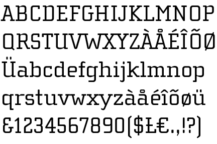
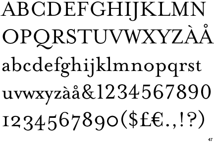
- The Filosofia Grand family is intended for display applications and is therefore more delicate and refined. Filosofia Unicase was developed to have stylistic variants to provide flexibility for headline use.
- Emigre
- Designer: Zuzana Licko
- 1998
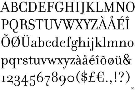
- Tarzana is not intended to be used as a body copy font; It's sans-serif design is slightly curved, it is used mostly for logo's or headlines.
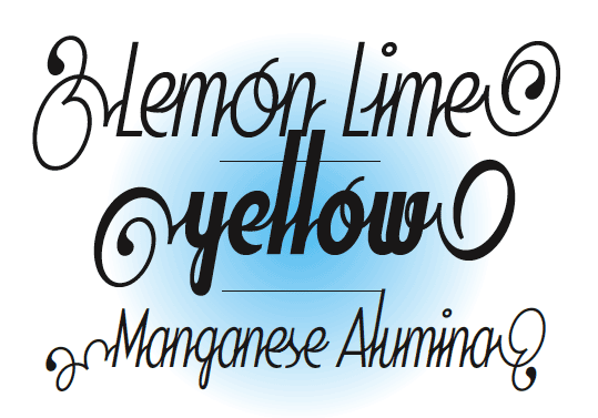
slight appearance of -
(both also emigre fonts)


